By Alex Smith | Published: October 26, 2023 | Category: Web Design Trends
Color is more than just an aesthetic choice in web design; it's a powerful psychological tool that can influence user perception, emotion, and behavior. Understanding the psychology of color allows designers to create experiences that resonate deeply with their audience, guiding them through a website and subtly influencing their decisions. At ideacraft, we believe that every pixel, including every hue, serves a purpose.
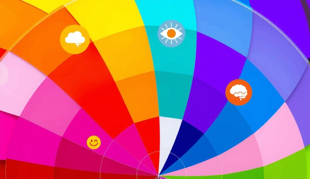
The Emotional Spectrum of Colors
Different colors evoke different emotions and associations. These interpretations can vary culturally, but there are universal psychological responses that designers can leverage:
- Blue: Often associated with trust, stability, wisdom, and tranquility. It's a popular choice for corporate and tech websites.
- Red: Represents passion, energy, excitement, and urgency. It's often used for calls to action or to signify importance.
- Green: Linked to nature, growth, harmony, and freshness. Ideal for environmental, health, or financial websites.
- Yellow: Evokes happiness, optimism, and warmth. Can be used to draw attention but should be used carefully to avoid overwhelming users.
- Orange: Combines red's energy with yellow's cheerfulness, suggesting creativity, enthusiasm, and warmth.
- Purple: Associated with royalty, luxury, power, and ambition. Often used for high-end brands or creative industries.
- Black: Signifies sophistication, elegance, authority, and strength. Commonly used in luxury branding and minimalist designs.
- White: Represents purity, cleanliness, simplicity, and efficiency. Often serves as a background color to enhance readability.

Color Harmony and Contrast
Achieving color harmony is crucial for a visually appealing and comfortable user experience. This involves selecting colors that work well together, often using color theory principles:
- Complementary Colors: Colors opposite each other on the color wheel, offering high contrast and vibrancy.
- Analogous Colors: Colors next to each other on the color wheel, creating a serene and comfortable feel.
- Triadic Colors: Three colors evenly spaced on the color wheel, offering a strong visual contrast while retaining harmony.
- Monochromatic Colors: Different shades, tones, and tints of a single color, providing a subtle and sophisticated look.
Contrast is equally important, especially for accessibility. Sufficient contrast between text and background colors ensures readability for all users, including those with visual impairments. Tools and guidelines like WCAG (Web Content Accessibility Guidelines) provide standards for contrast ratios.
Branding and User Experience
Colors play a significant role in brand identity. A consistent color palette across all digital touchpoints reinforces brand recognition and communicates the brand's personality and values. For instance, a tech startup might use vibrant, energetic colors to convey innovation, while a luxury brand might opt for deep, rich tones to suggest exclusivity.
"Color is the keyboard, the eyes are the harmonies, the soul is the piano with many strings. The artist is the hand that plays, touching one key or another, to cause vibrations in the soul."
— Wassily Kandinsky
Ultimately, the strategic use of color enhances the overall user experience. It can guide users' eyes, highlight important information, create a specific mood, and establish a strong emotional connection with the brand. By carefully considering the psychological impact of colors, designers can craft websites that are not only visually stunning but also highly effective in achieving their goals.